
Client:
Air Vista (project under NDA)
My Role:
Lead product designer
Duration:
4 months
Responsibilities:
User research, stakeholder interactions, ideation and strategy, UX/UI design, usability testing
Problem:
Loyalty programs are meant to make members feel valued and appreciated, but a flagship Middle East airline’s loyalty program was falling short. The experience was outdated and disjointed, and without a centralized hub to track benefits or miles. Members struggled to trust the system, and many didn't know how to redeem their miles or fully benefit from their membership.
These challenges not only impacted membership sign-ups and user engagement, but also added strain to the business, with nearly 30% of calls focused on loyalty-related concerns.
To comply with my non-disclosure agreement, I have omitted and obfuscated confidential information in this case study.
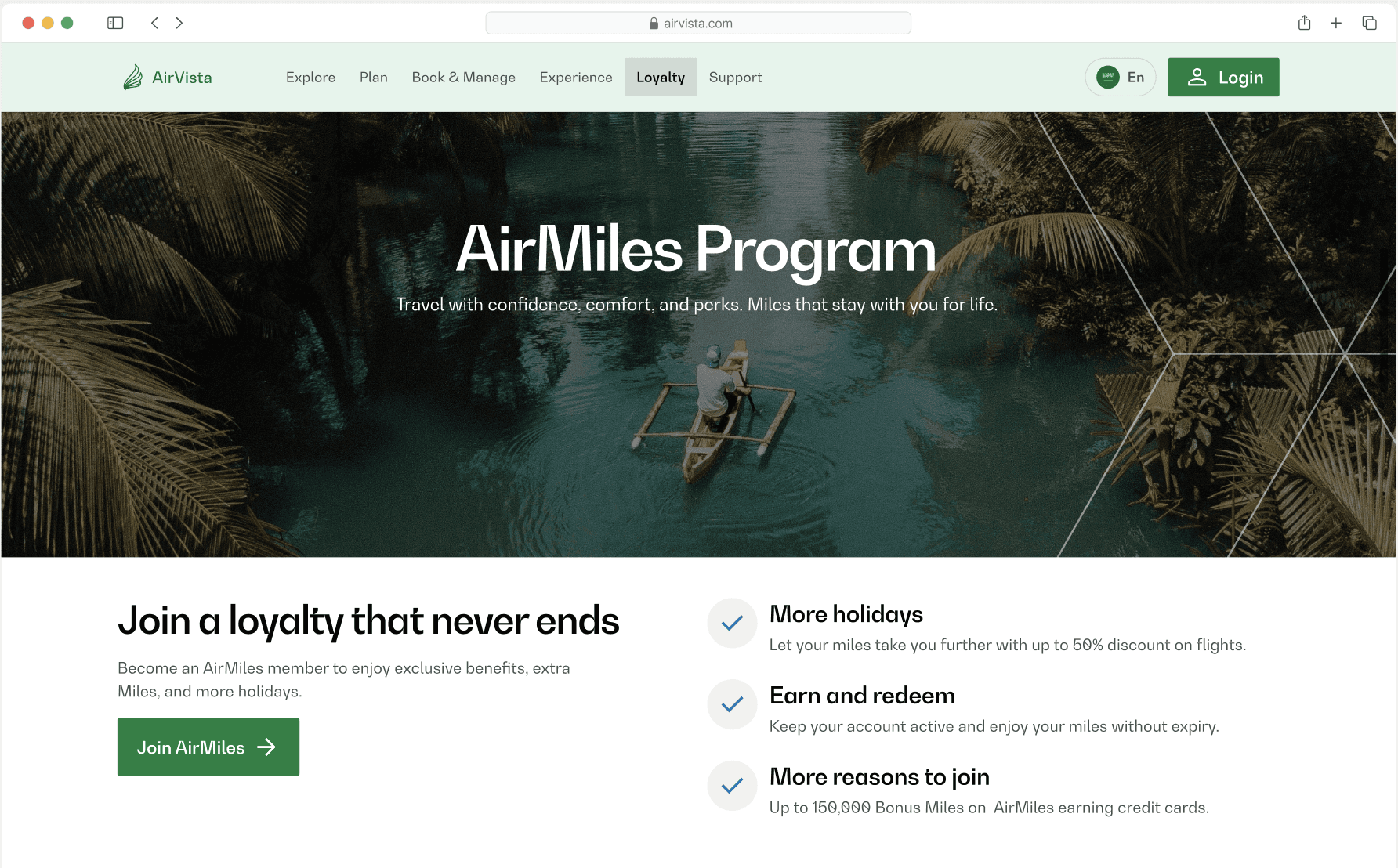
Solution:
We redesigned the Loyalty dashboard for desktop and brought it to the app for the first time, creating a seamless, on-the-go experience. Members can now easily track miles, access personalized offers, and manage their profiles - all in one place.

Problem space
But how could we reduce the call volume?
This client mandate was the starting point for rethinking how Air Vista could transform its loyalty experience.
The Air Vista team wanted to create a one-stop hub that married best practices with the specific needs of the Loyalty members, and addressed their biggest frustrations while while working with the technical constraints.
My approach focussed on
Understanding the users: Conducting surveys and talking to a few Loyalty members to uncover their pain points and expectations.
Collaborating with stakeholders: Alignment on business priorities to ensure the solution tackled high impact areas.
Learning from the best: Looking at Middle East Loyalty programs and other leading global airlines to identify best practices.
Evaluating the current experience: Auditing the existing screens and user flows to pinpoint areas of friction and opportunities for improvement.
The goal was clear: establish a solid research base to design a loyalty program that not only worked, but also delighted.
Usability Testing
Listening to users
To understand how users interacted with the loyalty program, we conducted usability testing with 13 participants across key demographics. The aim was to uncover pain points, validate initial assumptions and provide actionable insights.
The process
Screening survey: Before testing, a screening survey was distributed to filter participants based on age, travel frequency and familiarity with loyalty programs, which helped us recruit diverse participants.
1:1 interviews: We conducted detailed one-on-one interviews to uncover user perceptions, pain points and areas for improvement. Participants interacted with interactive prototypes of the web and app.
Findings
Unclear joining benefits: 9/13 participants struggled to understand the value of joining the program.
User quote: "I'm not sure what I get by joining."
Overwhelming registration process: Majority of the participants found the registration form very long, with too many fields.
User quote: "I gave up halfway-why do they need all this information upfront?"
Fragmented user journeys: 7/13 participants mentioned difficulties in accessing important actions like updating their profile, claiming miles, and adding members to the family program.
User quote: "Why do I need to go through multiple steps to claim my miles?"
Desire to see total reward miles: All users like to check their reward miles to check if they can book a trip with miles.
User quote: "I always check my miles to see if I have enough to book flights for my next trip."
Milestone calculation: 9/13 participants didn't like the tier progress indicator.
User quote: "I earned 2,000 miles, but how much do I need to reach the next tier?"
Limited personalization: 6/13 participants reported that offers felt generic.
User quote: "Why am I seeing family vacation deals when I travel only for work?"
Key insights
Identifying the gaps: what we discovered

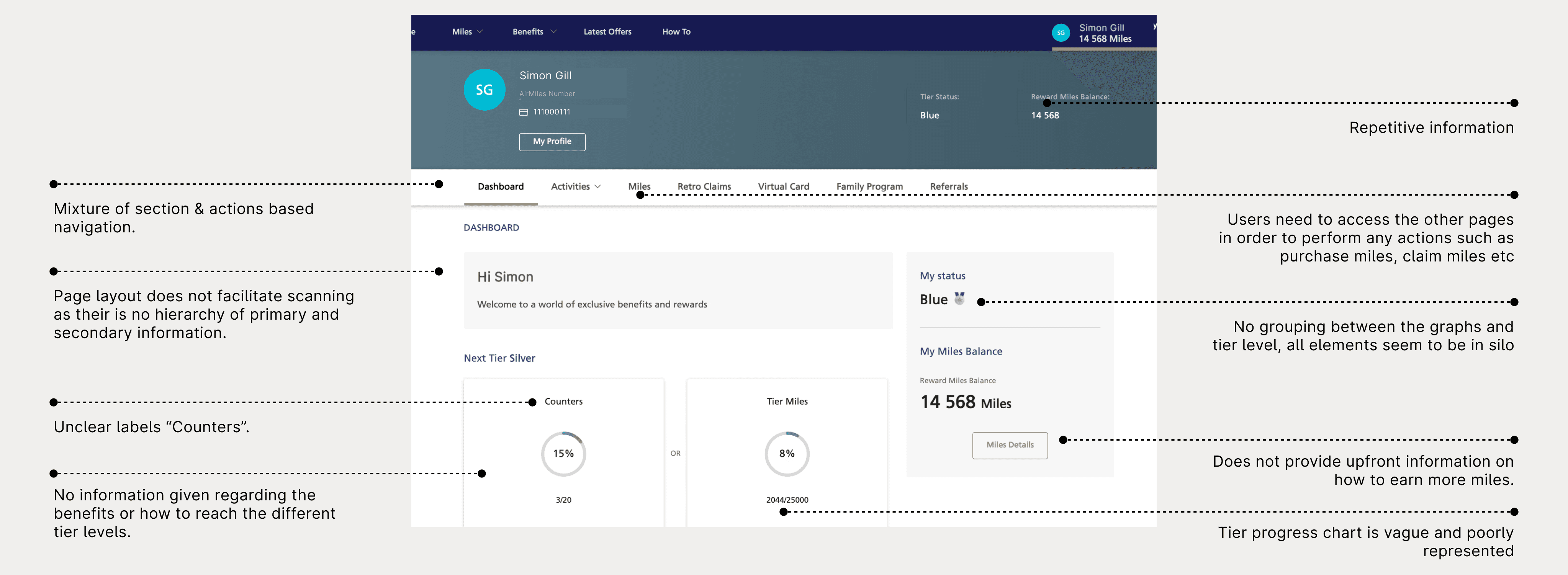
Experience audit
What is the current experience like?
To uncover the gaps, we conducted an in-depth evaluation of the existing loyalty screens for both guest users and logged-in members. By analyzing the landing page, the registration form and the dashboard, we identified areas that caused friction for users.


Competitive analysis
What are the current best practices?
To reimagine a more engaging Loyalty experience, we turned to the best in the industry. Starting with 5 top airlines in the Middle East, we expanded our research to include 14 globally renowned airline loyalty programs.
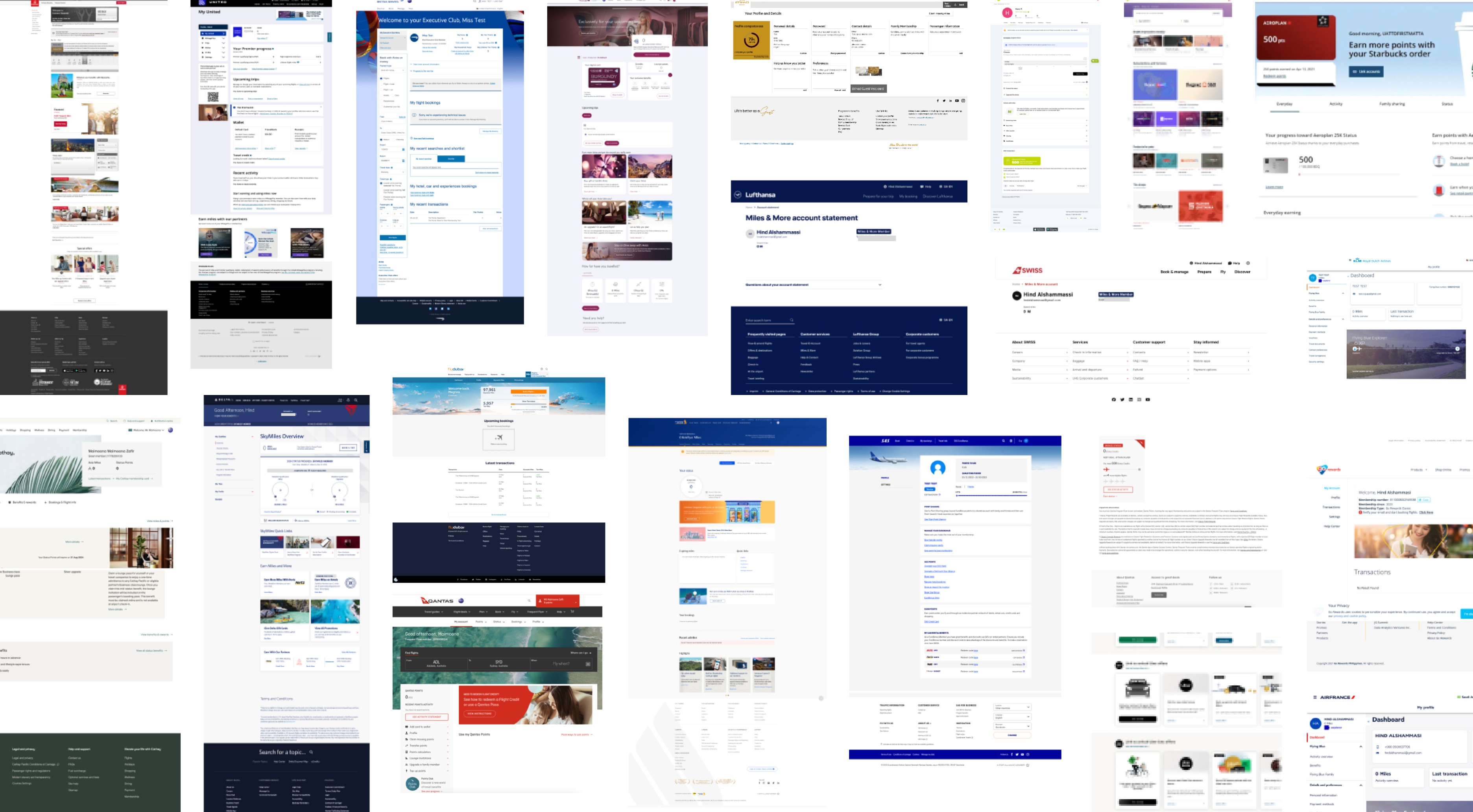
What we discovered
While some programs had purely informational content, others leaned into aspirational content with highly engaging visuals. The standout programs struck the right balance between clarity, motivation, and accessibility.
Four best practices of successful loyalty programs were:
Benefits front and center: Successful programs communicate value right at first glance.
Ease of registration: Simplicity is key. Forms should have minimal input fields with clear CTAs.
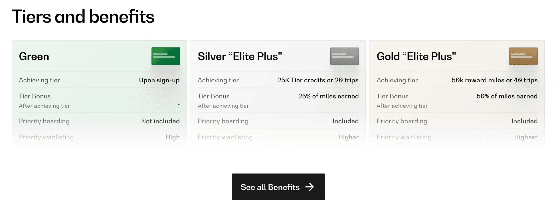
Progress motivation: Programs that visually break down membership tiers (Bronze, Silver, Gold) and highlight the perks of leveling up keep users motivated to earn more miles.
Transparency in partner offers: Partner brands are prominently displayed alongwith their benefits.
UX Phase
Putting it all together
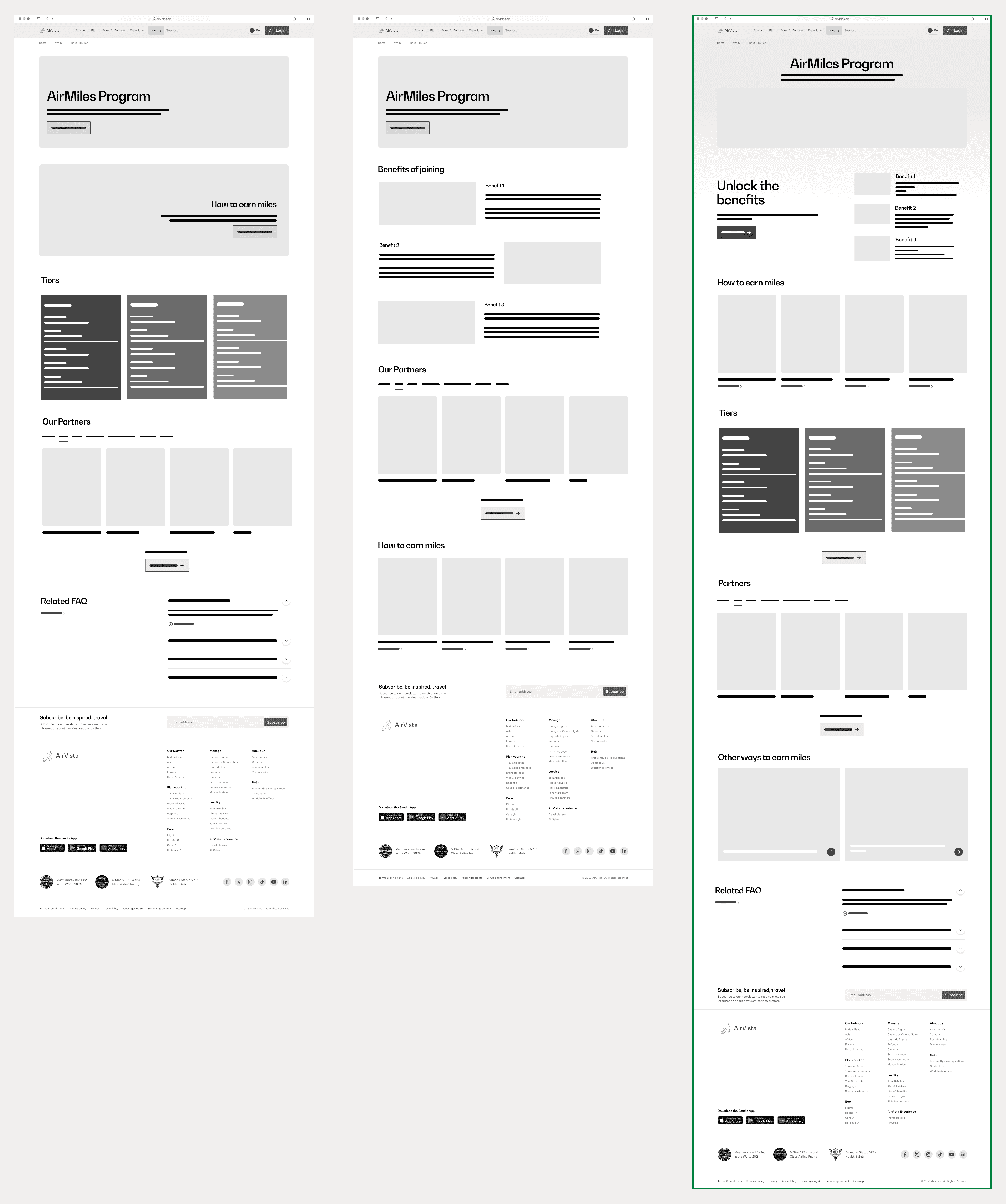
Reimagining the landing page
The landing page was the program's first impression, so it needed to make a strong case on why users should register for it by addressing key needs:
How might users see the value and benefits of joining the program?
How might users view how they can progress through the tiers?
How might users view partner tie-ups and see how they can easily combine other programs to this one?
We went through several iterations, prioritizing information hierarchy and a clear structure. Below are some of the wireframes we explored, with the finalized version outlined in green.

UI Phase
The Solutions
With the wireframes finalized and approved, our focus shifted to transalating them into visually engaging, brand aligned mockups for both the landing page and the dashboard.
Landing page
There was an opportunity to communicate the value of joing the Loyalty program while keeping users engaged and informed, and that's what we set out to do.
Challenge 1: How might users see the value and benefits of joining the program?
Key design decisions:
Benefits are front and center, displayed in the first fold with concise messaging to grab attention and show immediate value.
A prominent 'Join' button encourages quick action.
Challenge 2: How might users view how they can progress through the tiers?
Key design decision:
A snapshot of most important tier information is represented upfront, with the ability to see all the benefits on a separated dedicated page.
Challenge 3: How might users view partner tie-ups and see how they can easily combine other programs to this one?
Key design decision:
Partner tie-ups with their rewards are shown clealy, making the program's ecosystem transparent.

Below is a comparison view of our revamped landing page.


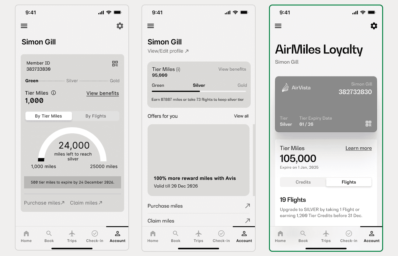
Dashboard
While the landing page was designed to attract and inform new users, the dashboard aimed to enhance engagement for existing members by providing actionable insights at a glance.
Key design decision:
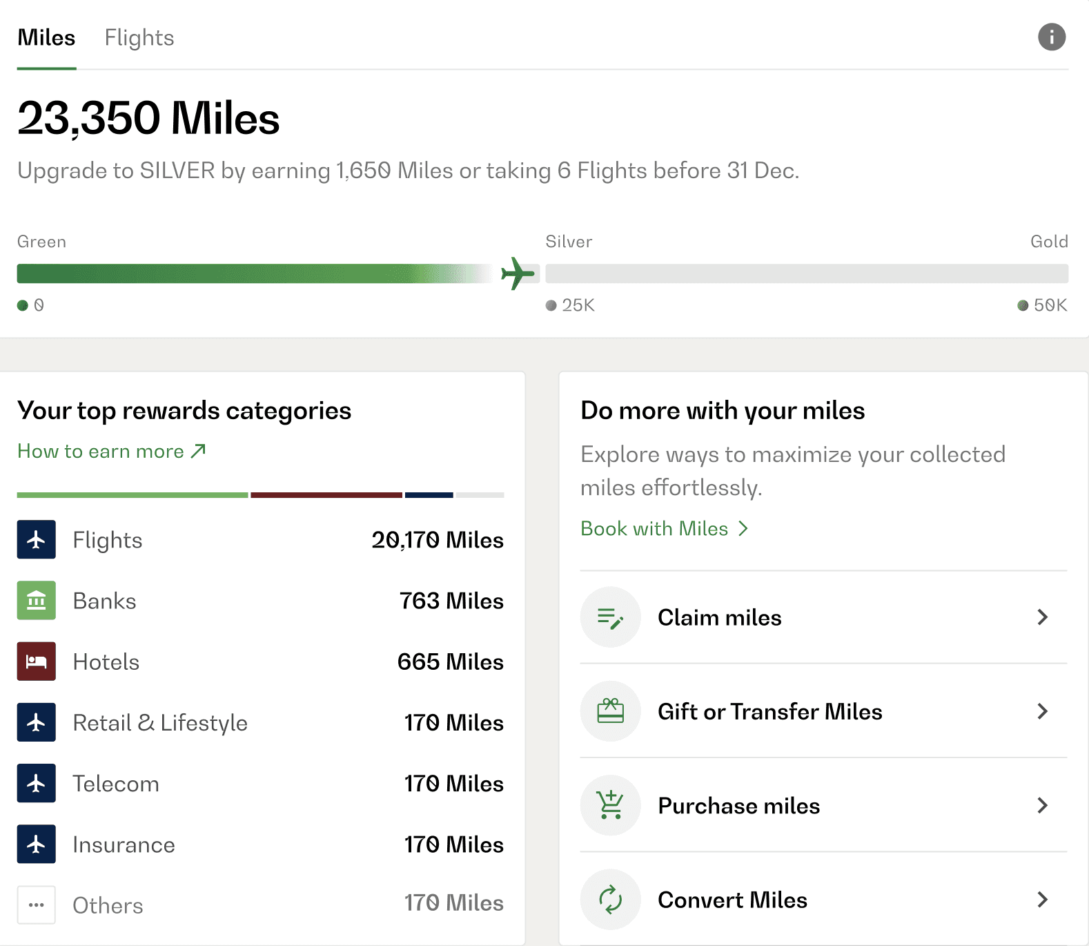
Miles balance is displayed prominently, along with a section that shows a breakdown on how the miles were earned. A link which redirects users to learn how to earn more miles is also present.
Key design decision:
A progress bar visually shows how close they are to the next tier.
Key design decision:
A dedicated section provides a clear CTA to book tickets with collected miles, and lists all other related features.
Challenge 4: How might they explore personalised offers based on their interests and travel history?
Key design decisions:
Personalized offers are highlighted with descriptions that connect them to the user's previous activity, making the dashboard feel tailored and engaging.


Impact
How design transformed the experience
The revamped loyalty program drove measurable business results, improving accessibility, reducing customer support dependency and enhancing the user engagement.

Reflections
Lessons that shaped the journey
Throughout the project, we gained insights that helped strengthen our approach to collaboration, scope management and user-centered thinking.
